Wecasa
Refreshing a leader with more personality.
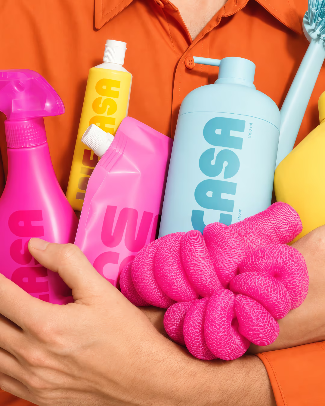
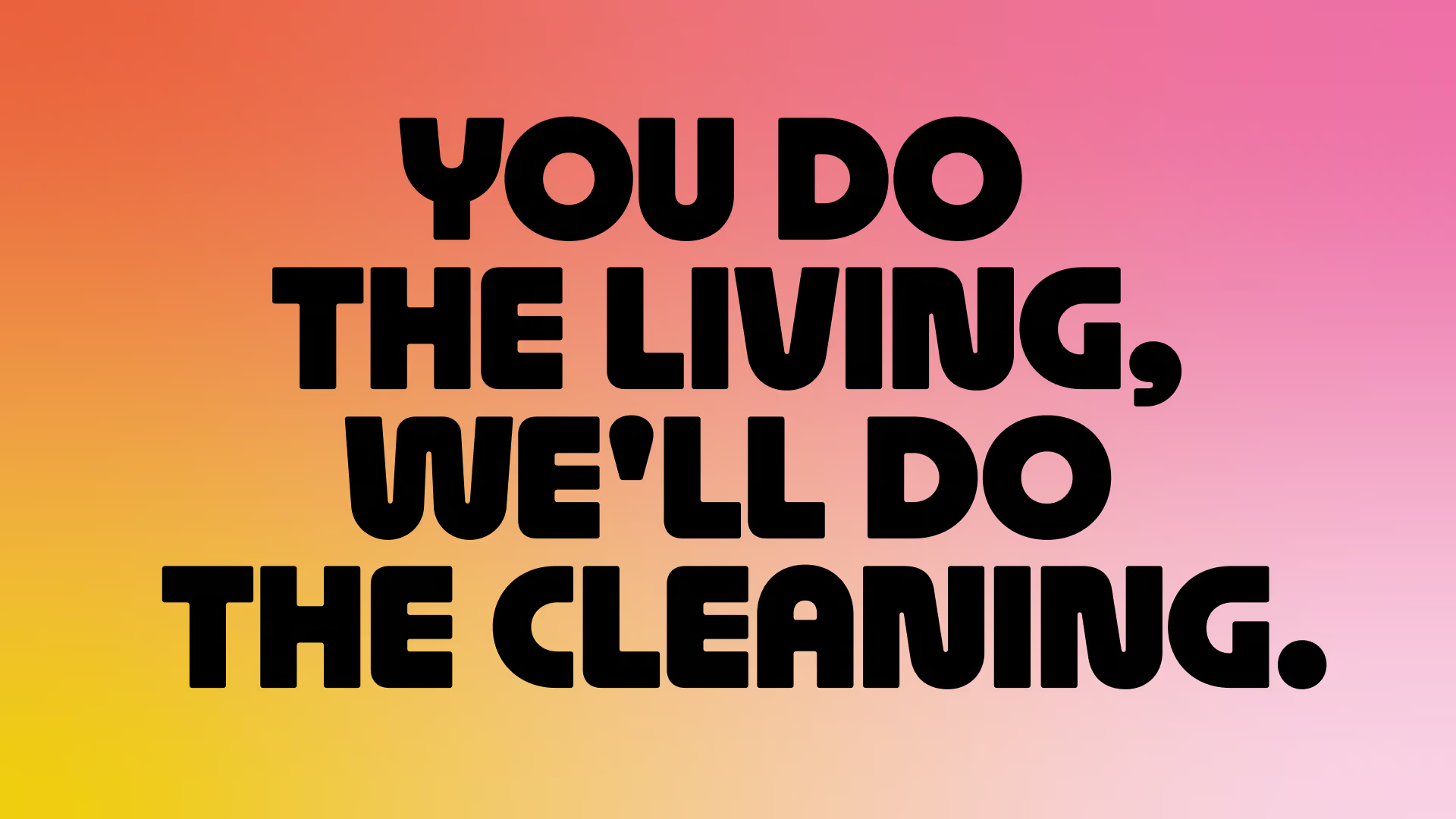
You do the living. We do the cleaning.
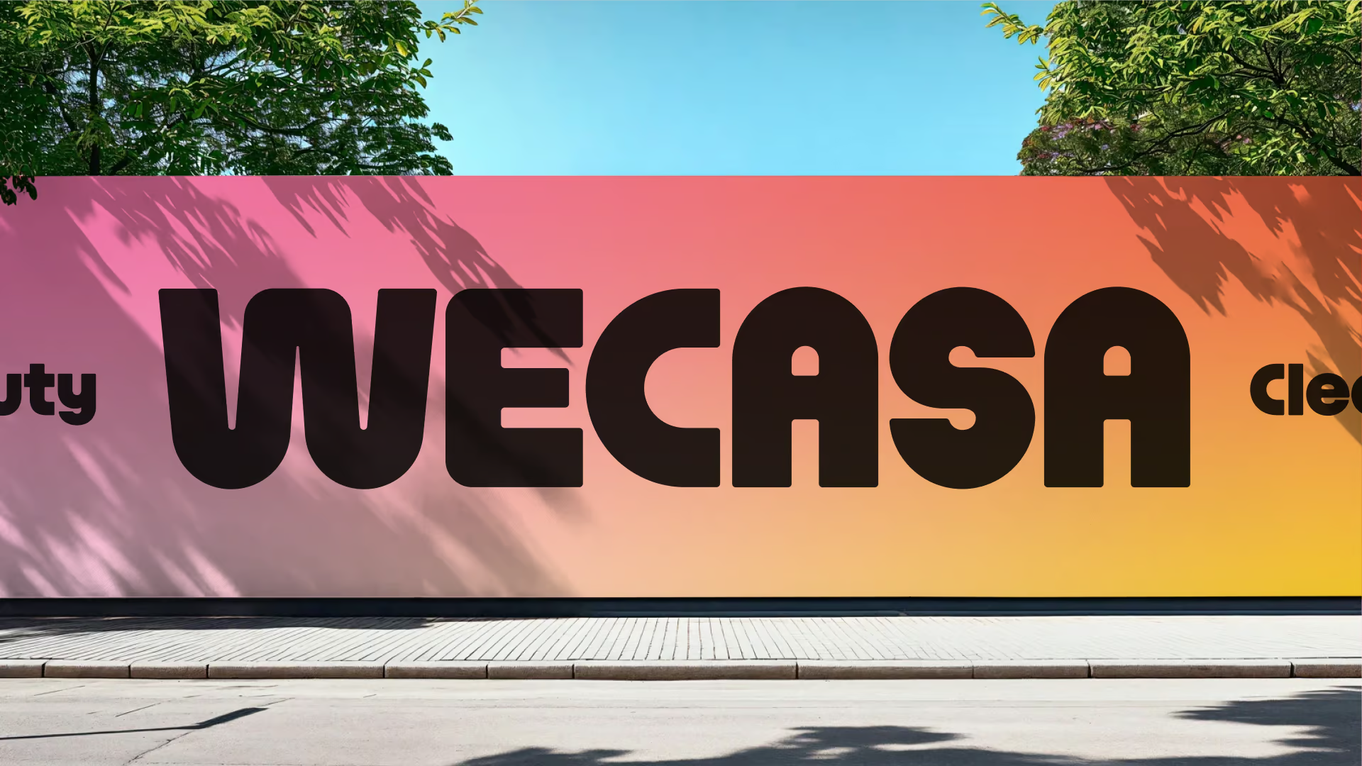
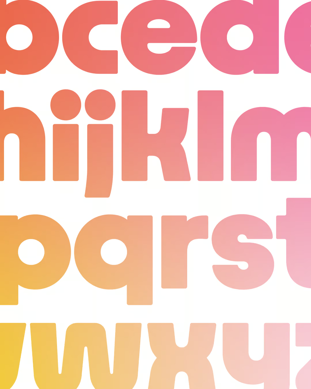
Wecasa had grown up, and its visual identity needed to catch up. Our scope focused on two key tasks: redesigning their logo and creating a custom typeface. The goal was to give them a fresher, more mature look that reflected who they are today without losing their quirky friendly personality their customers love.
Our guiding thread was Wecasa’s true DNA: the feeling of home. Everything started from that sense of familiar comfort, generosity, and everyday well-being. We focused on translating that cozy, comforting 'cocoon' vibe into every detail of the design.
We struck a careful balance between clean geometry and a warm, friendly, slightly groovy vibe. The custom logo features soft, rounded letters designed to subtly evoke little human figures - highlighting the care, closeness, and personal connection behind Wecasa’s services. By blending structured typographic precision with these welcoming organic shapes, we achieved an identity that feels both mature and creatively distinct.
Logo Design
Typography
Constant Revest
Camille Dechartres
Fanny Guilhen
Clarisse Talleux
+400
recruited service providers
+40 m€ ARR
in the year following the rebranding

.avif)