Skarlett
Breaking category conventions.
From oldies to goldies
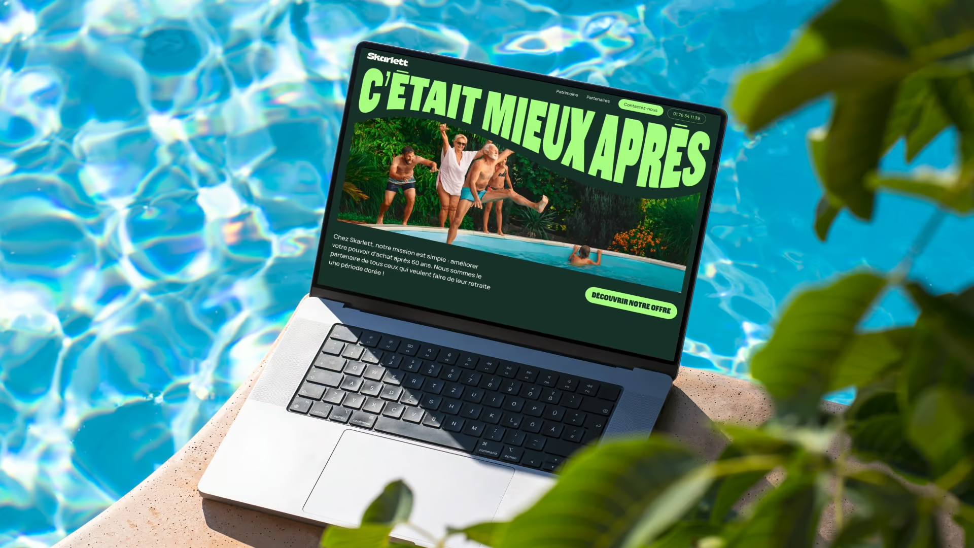
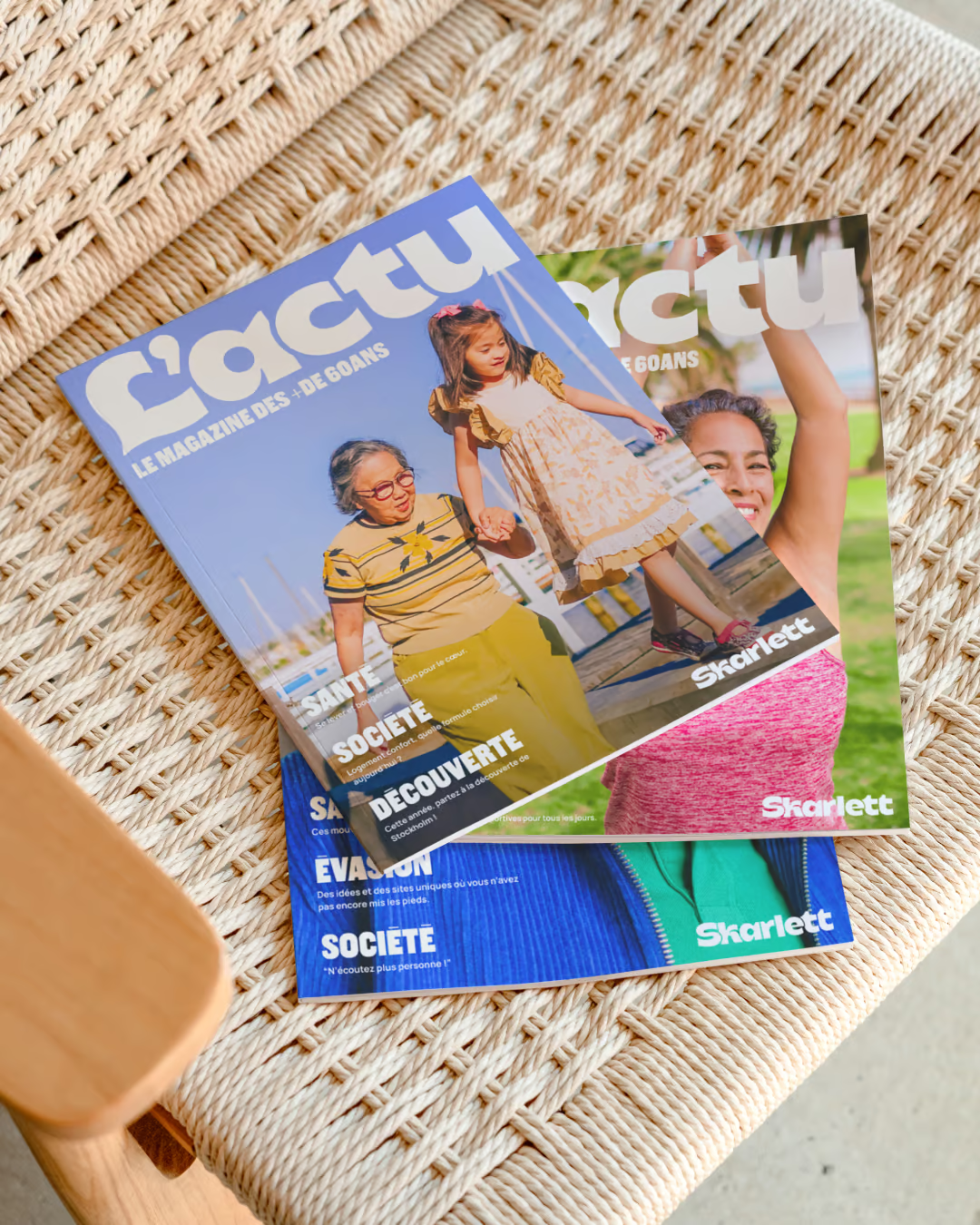
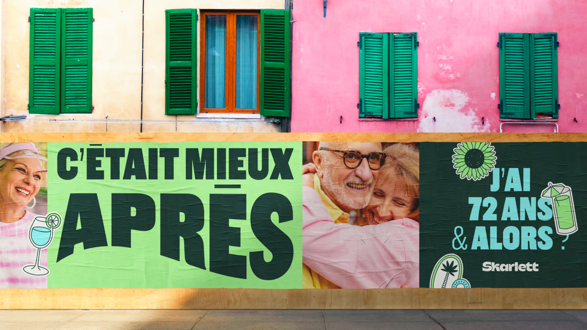
Preconceptions about people over 60 are everywhere, reducing a third of the population to outdated stereotypes. When Skarlett launched its ecosystem of financial services and equity release, the challenge was to build a brand for seniors that looked nothing like a traditional "senior brand." We needed to bypass the dull, patronizing tropes of the industry and create a launch identity that reflects how over-60s actually live today: active, enterprising, and full of energy.
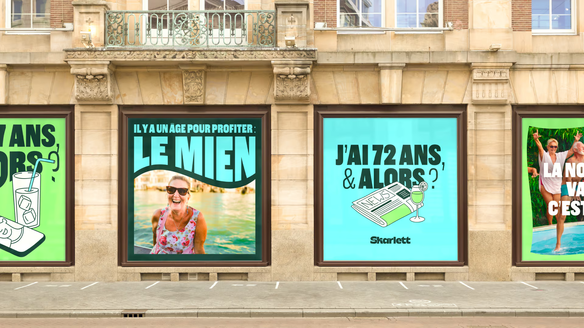
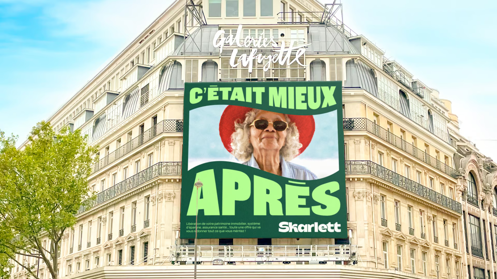
We flipped the classic cliché "it was better before" on its head to create a new guiding thread: "it was better after." Our strategy centered on an epicurean carpe diem philosophy, showing that the life awaiting after 60 is a true dolce vita. Rather than treating retirement as a wind-down, we framed Skarlett as an empowering ally that restores financial freedom to seniors, celebrating a generation ready to blossom and live their best years now.
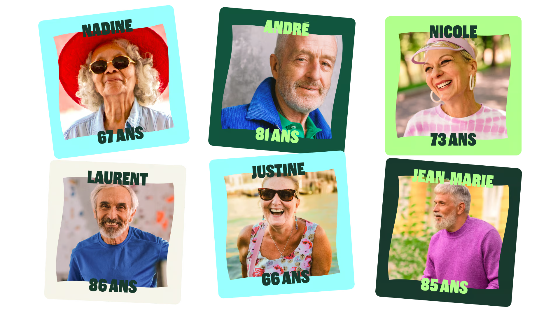
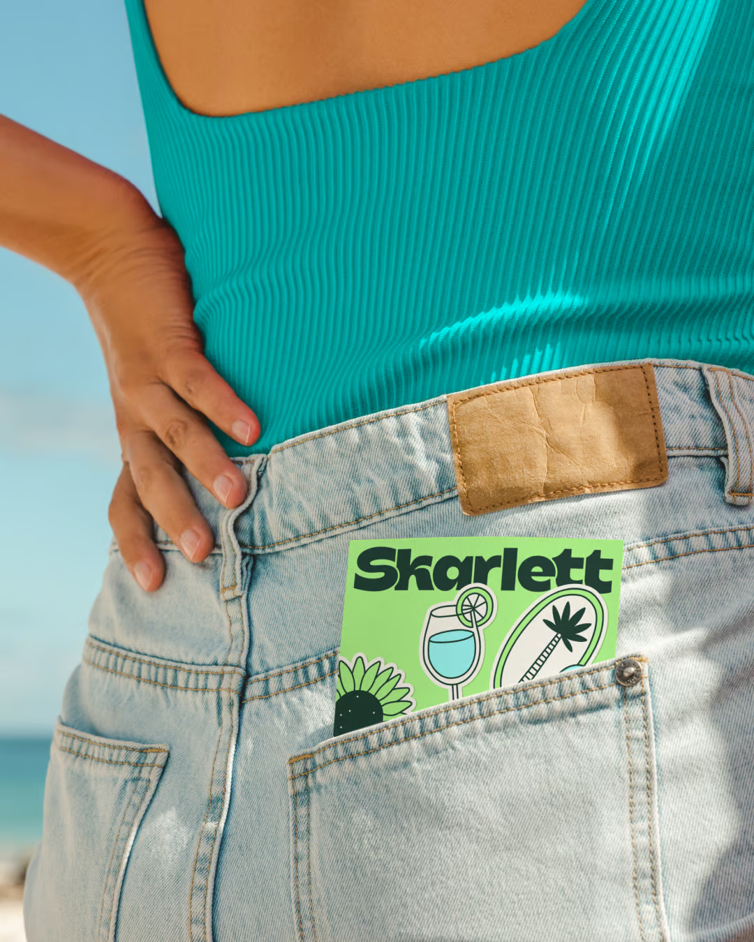
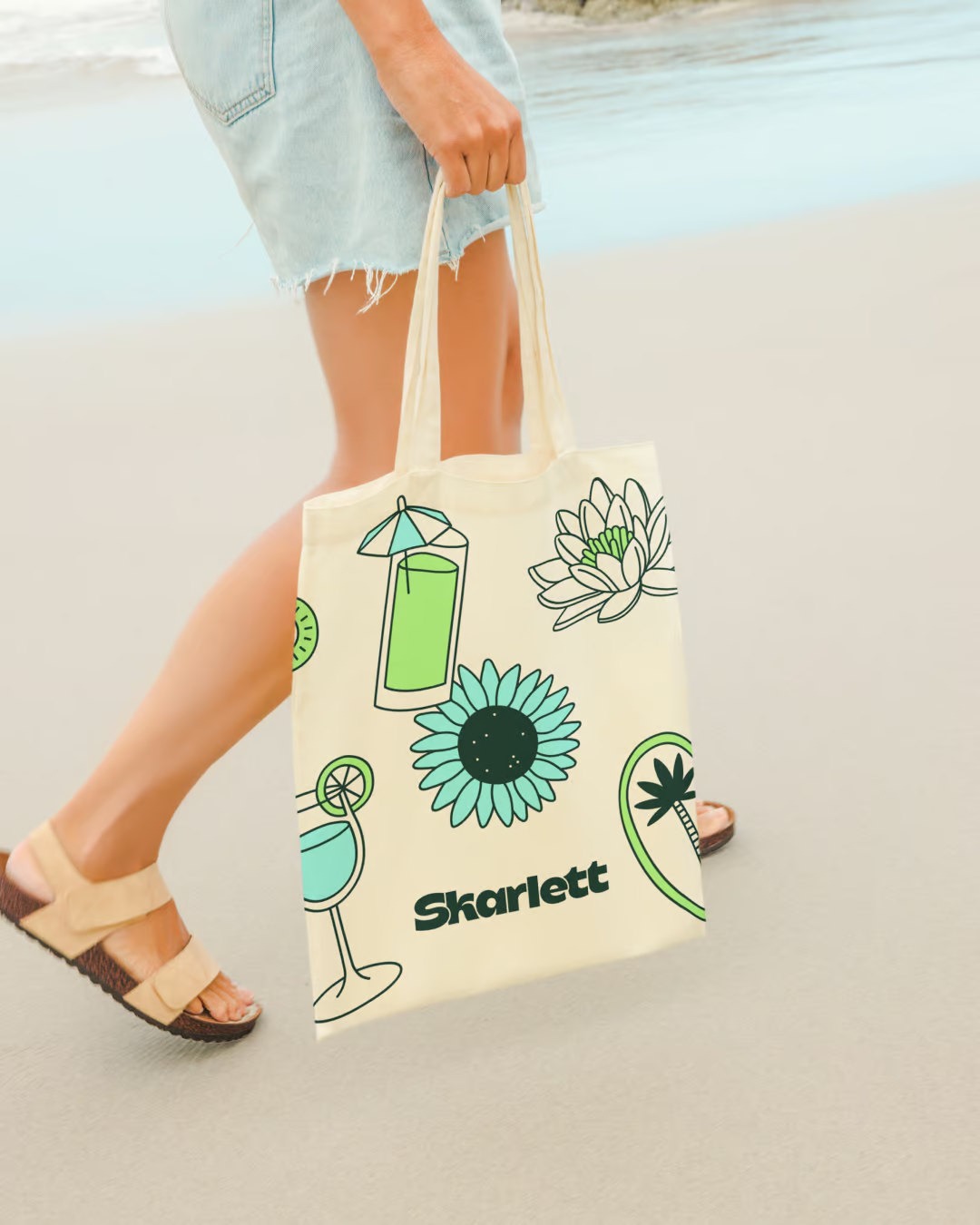
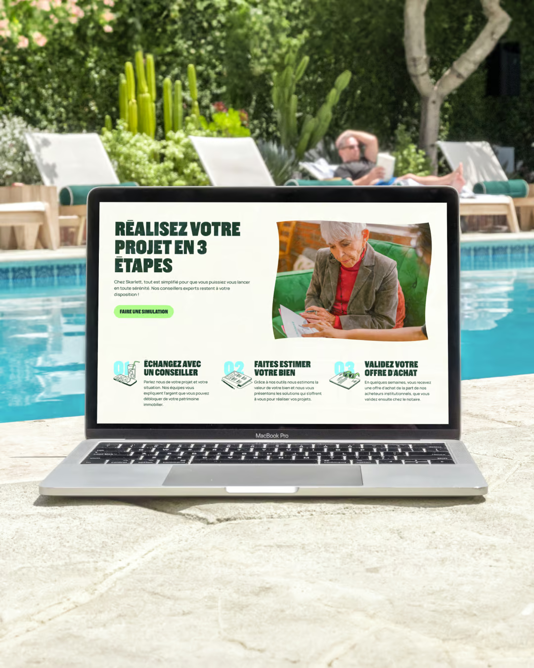
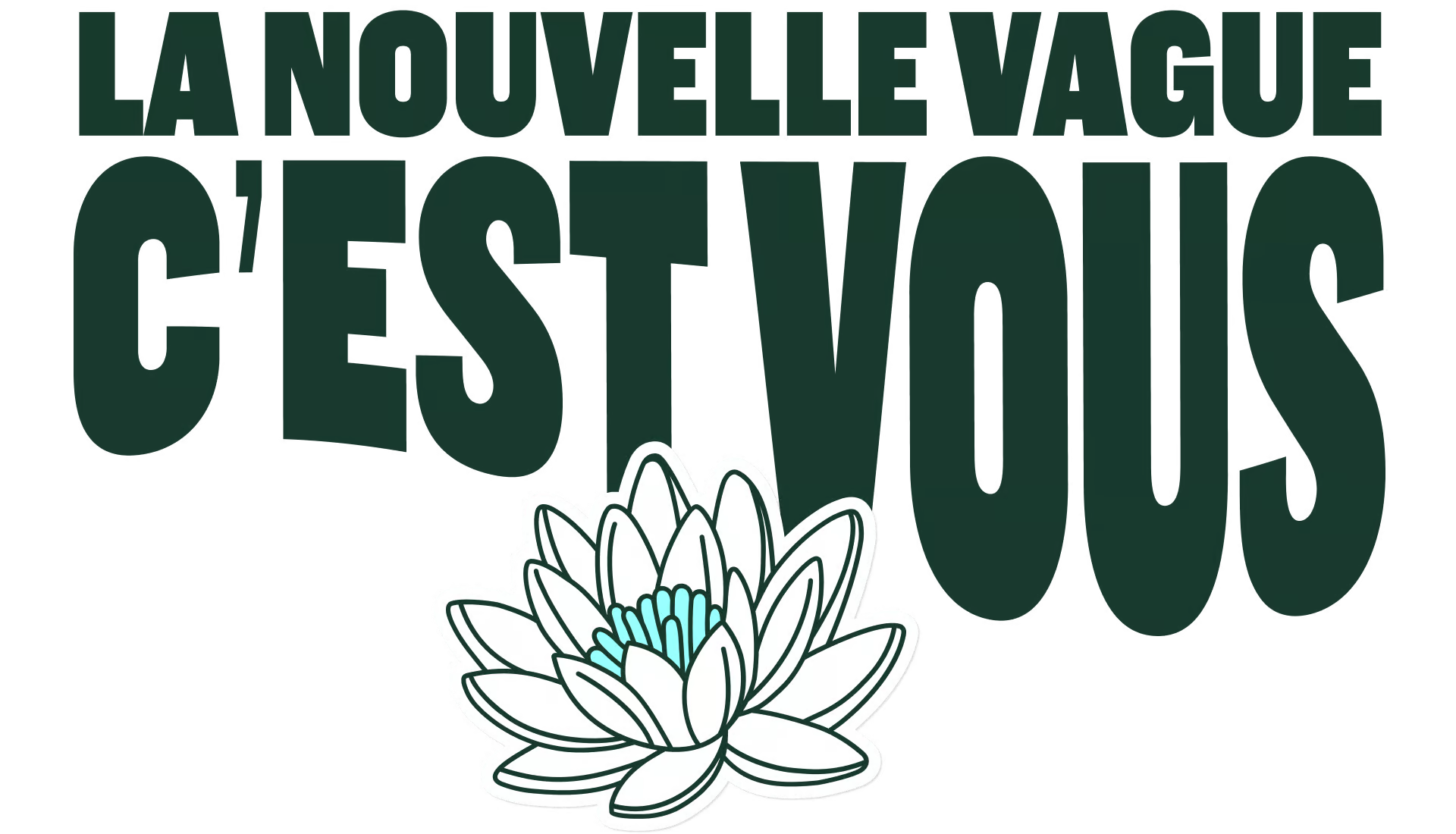
The identity is modern, vibrant, and bursting with life. We created a bubbly, groovy visual universe anchored by a fluid logo whose wavy curves draw directly from the dolce vita spirit. Ditching dreary industry colors for a lively palette, the brand comes to life through authentic photography that captures real people in full carpe diem mode. It is a joyful, refreshing visual territory that proves age is just a number.
Strategy
Visual Identity
Verbal Identity
UX/UI
Development
Illustration
Enya Achi
Fanny Guilhen
Coline Ferru
Axel Sigurdsson
David Pavel
Frédéric Le Gall
+400% ARR
in the year following the rebrand
8 m€
seed funding round, led by 155K, bringing their total financing at the time to €12 million.